Introduction:
For our final project, we were tasked with finding a photo advertisement that we liked and recreating it using multiple of the Adobe processes we’ve been learning about: InDesign, Illustrator, and Photoshop. Our goal was to create an ad that could look cohesive with an existing ad campaign. I found an ad from the Vans “Living Off The Wall” documentary series.
Original Ad:
Here is the link to the original ad:
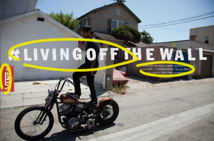
Design: The shows alignment with the subject being on the upper left third, and there is repetition with the white tagline, body copy, and font of the logo. There is contrast with the center of the photo and the darkened edges, and with the dark background of the photo with the white text on top of it. We can see proximity in the copy, logo, and tagline being on the same line, which is shown in the draw-over.
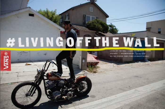
Color: The colors of the text are all the same, which keeps it consistent, and there are muted colors on the rest of the photo with a pop of red of the logo, which is shown in the draw-over.
Typography: The tagline is a sans serif block font, similar to the font of the logo. The body copy is also a sans serif font, which is shown in the draw-over.
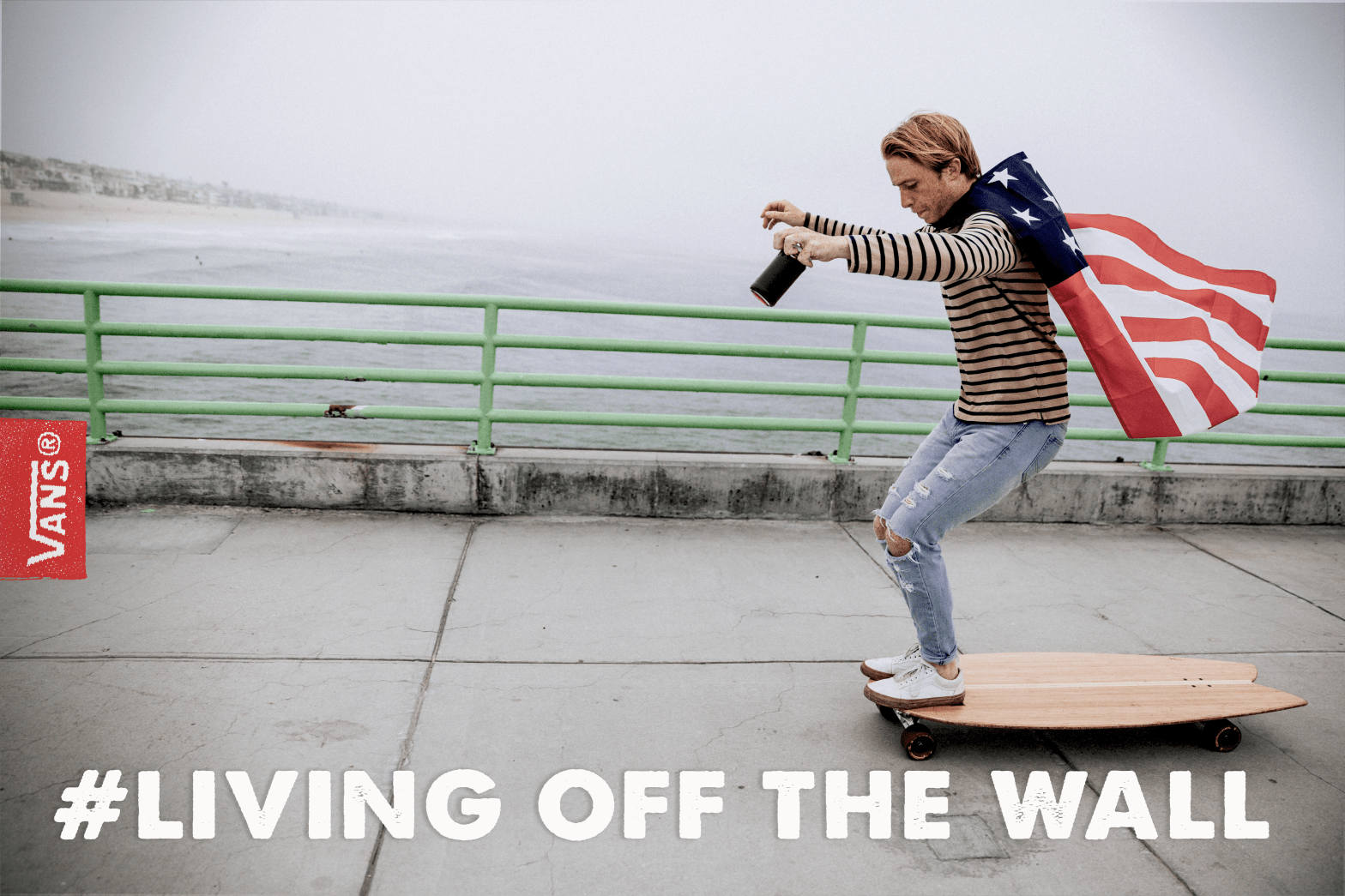
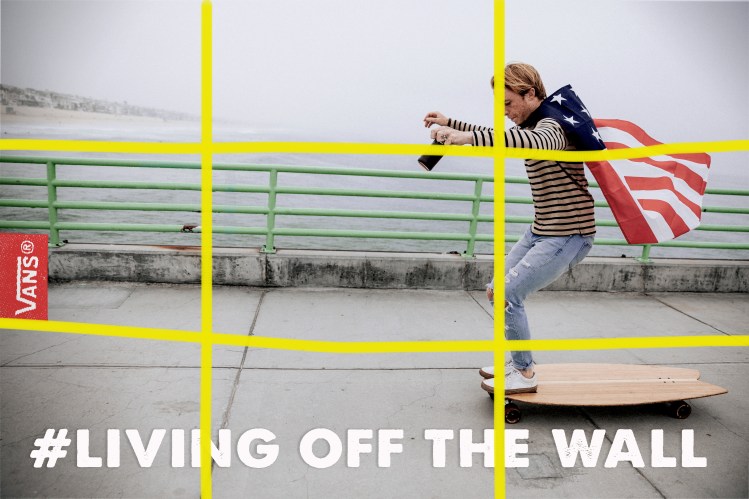
New Ad:
Then, to recreate the ad, I pulled an action shot of a man skating while wearing Vans from Unsplash. I altered the photo, so it originally looked somewhat different. This is the ad I created:
Photo by Nathan Dumlao on Unsplash.
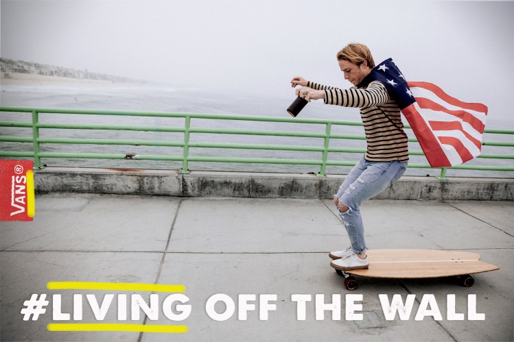
This ad also showcases alignment with the man being on the rule of thirds, which you can see in the draw-over, and the tagline is aligned with the logo. The logo is also in the exact same location as the original ad, which showcases proximity between the two ads. There is repetition with the typography colors, and contrast with the white color and the gray pavement, and with the same gradient around the corners of the image.
Color: The red flag and red logo are coordinating colors, which you can see in the draw-over and the typography is the same shade as well.
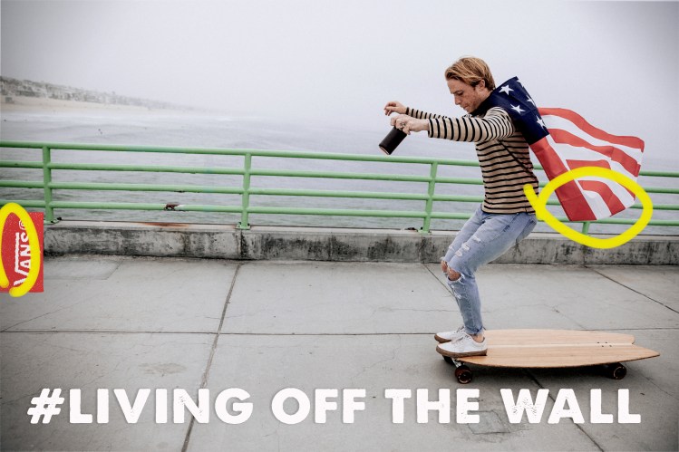
Typography: I picked a Sans Serif font that coordinates with that of the logo and has the same blocky nature, which you can see in the draw-over.
Conclusion:
These ads work together because they both feature men wearing vans and living active lifestyles, and there is similarities with the typography and logo placement and the shadows of each image.
